Avoid These 8 Common UI Design Mistakes
Avoid These 8 Common UI Design Mistakes
Avoid These 8 Common UI Design Mistakes
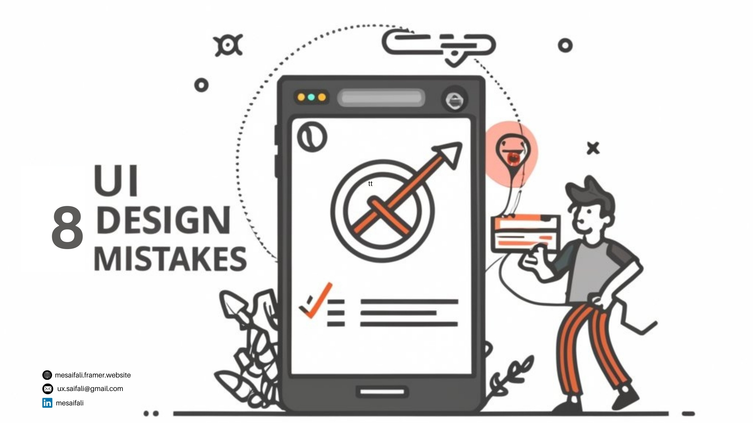
Crafting an intuitive user interface that effectively guides users requires awareness of key usability principles. However, even seasoned designers make some common UI design mistakes that negatively impact user experience.
Let’s review 8 prevalent UI pitfalls to avoid when designing your next digital product, service, or website.
1. Using Too Much Color
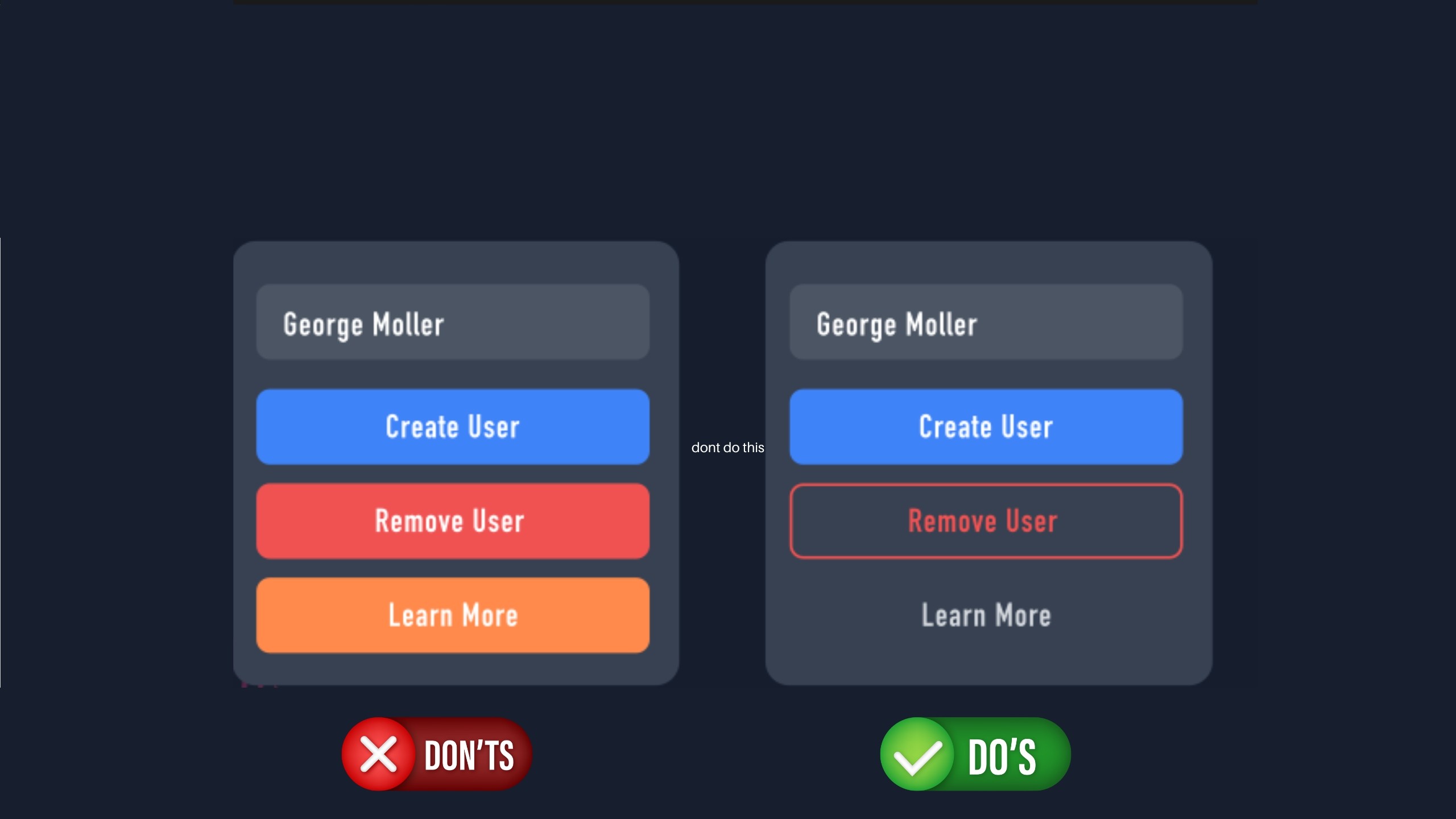
all images credit goes to George Moller (_georgemoller)
While vibrant and exciting color palettes attract attention initially, overloading multiple bright hues without clear visual hierarchy quickly fatigues users. Prioritize a focused triad of 1 primary, secondary and accent colors instead of overusing a rainbow scheme. Stick with shades that complement both your brand identity and align with end user color preferences for harmony.
2. Poor Visual Hierarchy
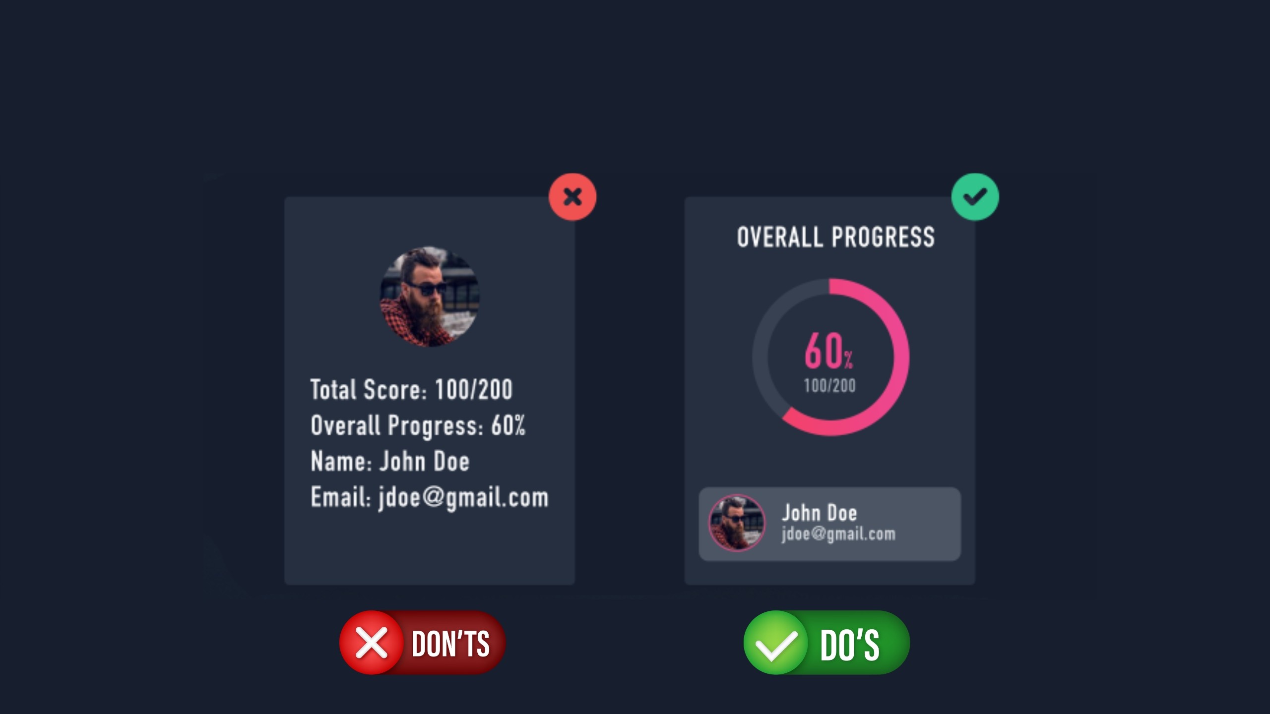
Without clear visual hierarchy guiding users towards key actions, interfaces become chaotic seas of elements competing for attention rather than telling an intentional story. Define and architect distinct zones, layout grids and information architecture to direct focus in order of priority – from headings to body copy, utility areas and supplementary content.
3. Being Inconsistent
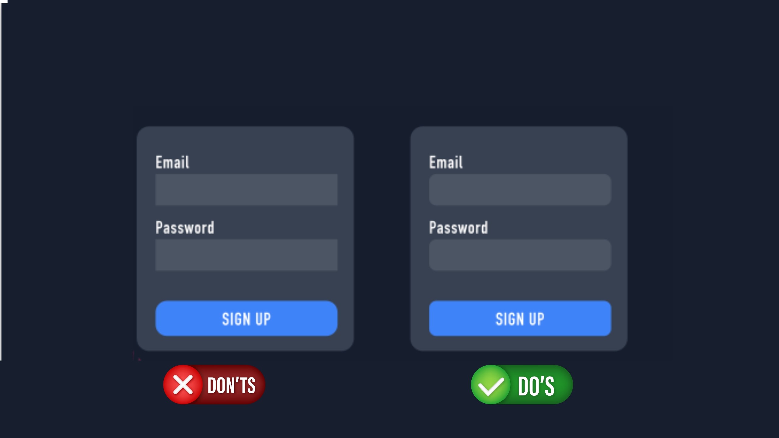
Patterns should serve as intuitive guides, not sources of confusion through unpredictability. From design style to terminology choice and frameworks leveraged, consistency in UIs avoids requiring users to re-learn flows, labels, or paradigm mental models at each interaction point. Establish style guides and modular design systems early to unify experiences.
4. Too Narrow Button Touch Points
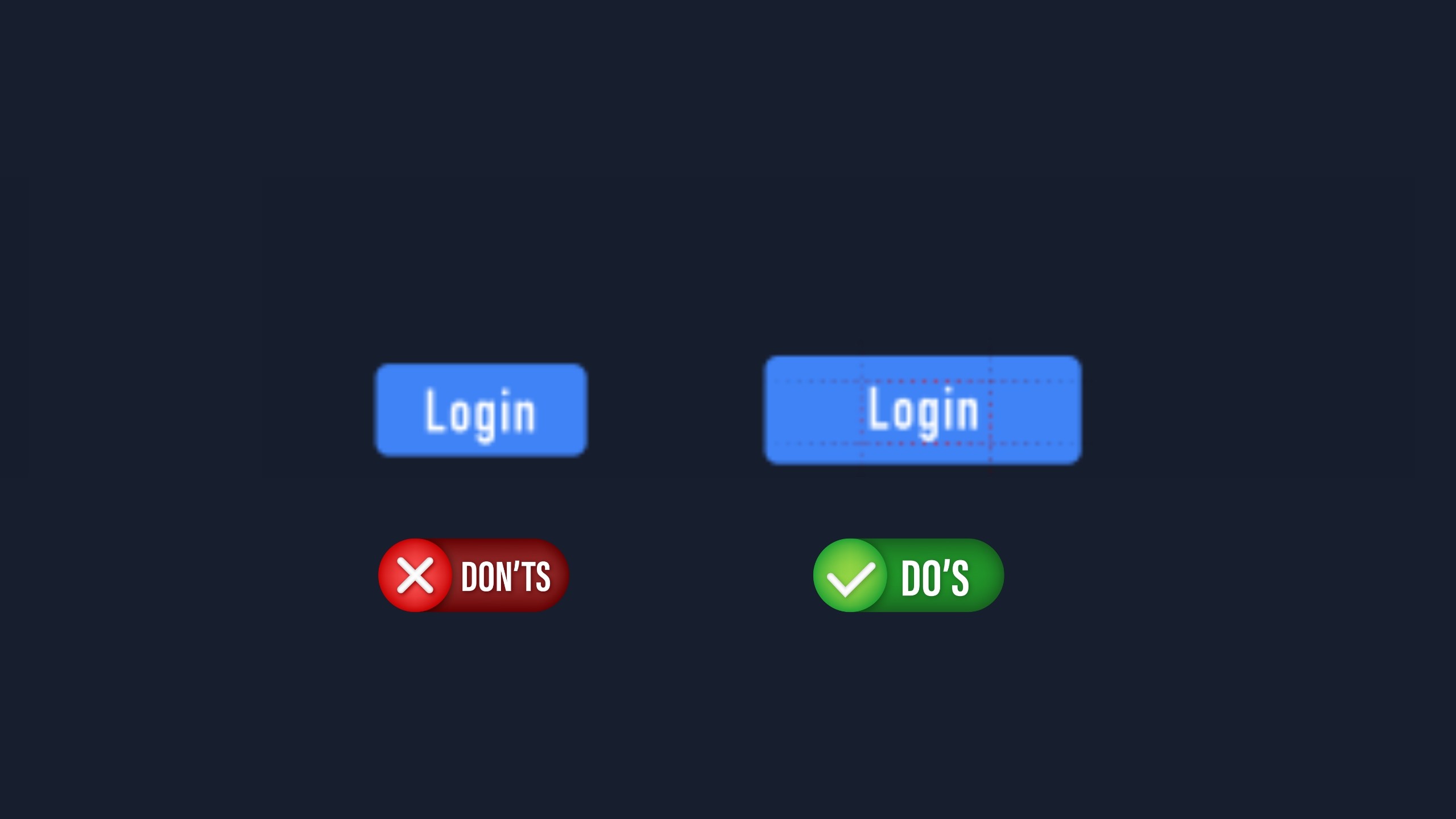
While compact interfaces feel clean and efficient, touch target size directly impacts user experience on mobile and tablet devices. If interactive elements are too small, users easily make errors hitting the wrong option. Follow platform-specific guidelines, but 45-50 pixels is a minimum recommended button size for error-free taps. Prioritize spacing between elements too for less mis-clicks.
5. Overusing Dark Backgrounds/Shadows

While muted color palettes and long dark shadows lend an aesthetically sleek look, glare and visibility issues often outweigh stylistic benefits especially among older users. Ensure essential iconography and critical text elements have sufficient contrast ratios and call-to-actions feel illuminated without heavy shadows obscuring interactability.
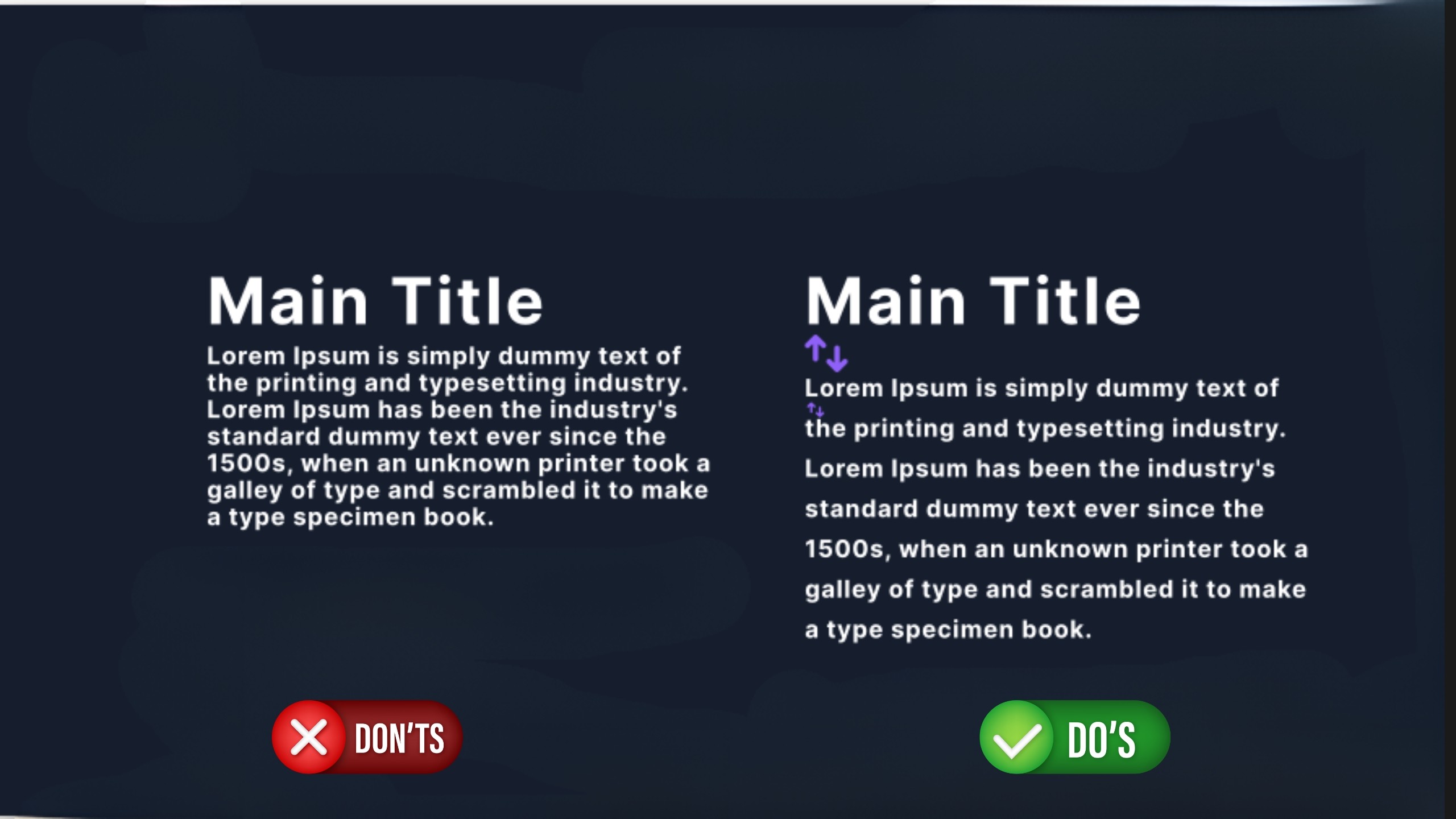
6. Relying on Heavy Font Weights
The bold text may initially grab attention but dense paragraphs and sections exclusively in black weights strain readability over longer content blocks. Lighten body copy for easier flow through ideas, leveraging blacks strategically to punctuate transitions or emphasize triggers. Give users’ eyes space to comprehend ideas fluidly.
7. Poor Content Alignment
Stray elements floating outside the containment of an implicit grid confuse users through inducing tension and pull where symmetry is expected. Establish column-based layout systems with consistent content “chunks” aligned intelligently into vertical stacks signal structured processes users can quickly scan and comprehend.
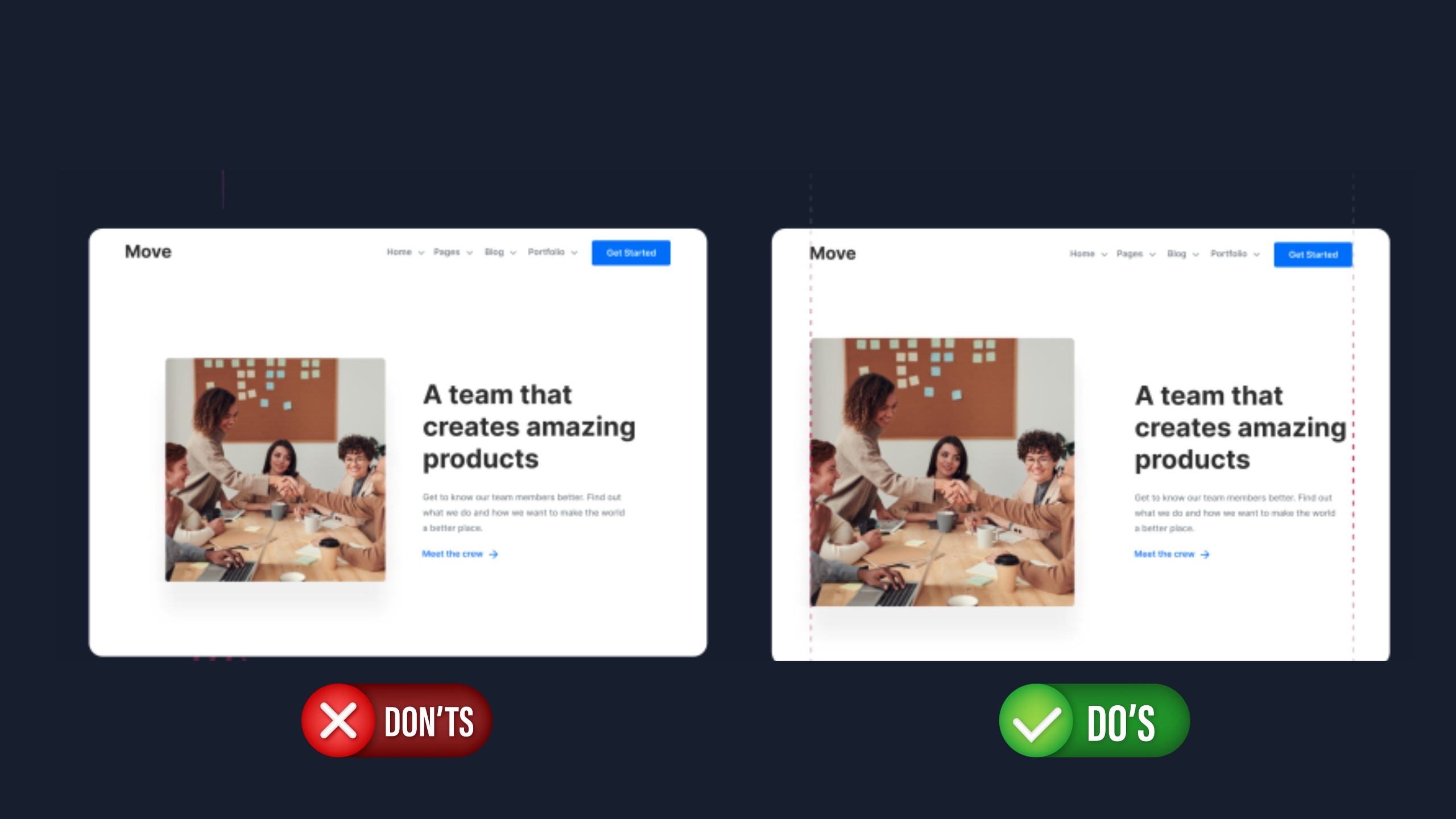
8. Not Enough White Space
While maximizing content density fits business goals, crammed interfaces bewilder users and offer no visual breathing room to orient focus. Set consistent padding scales between sets and strands of content sets to declutter flows. Follow the artful philosophy that less is more – negative space amplifies design impact.
By proactively avoiding these 8 prevalent pitfalls during the design process, UI architects craft experiences users inherently understand and enjoy engaging with across contexts and platforms. Smooth, intuitive interfaces anchor digital products people love to use over the long term through avoiding needless friction.
Crafting an intuitive user interface that effectively guides users requires awareness of key usability principles. However, even seasoned designers make some common UI design mistakes that negatively impact user experience.
Let’s review 8 prevalent UI pitfalls to avoid when designing your next digital product, service, or website.
1. Using Too Much Color
all images credit goes to George Moller (_georgemoller)
While vibrant and exciting color palettes attract attention initially, overloading multiple bright hues without clear visual hierarchy quickly fatigues users. Prioritize a focused triad of 1 primary, secondary and accent colors instead of overusing a rainbow scheme. Stick with shades that complement both your brand identity and align with end user color preferences for harmony.
2. Poor Visual Hierarchy
Without clear visual hierarchy guiding users towards key actions, interfaces become chaotic seas of elements competing for attention rather than telling an intentional story. Define and architect distinct zones, layout grids and information architecture to direct focus in order of priority – from headings to body copy, utility areas and supplementary content.
3. Being Inconsistent
Patterns should serve as intuitive guides, not sources of confusion through unpredictability. From design style to terminology choice and frameworks leveraged, consistency in UIs avoids requiring users to re-learn flows, labels, or paradigm mental models at each interaction point. Establish style guides and modular design systems early to unify experiences.
4. Too Narrow Button Touch Points
While compact interfaces feel clean and efficient, touch target size directly impacts user experience on mobile and tablet devices. If interactive elements are too small, users easily make errors hitting the wrong option. Follow platform-specific guidelines, but 45-50 pixels is a minimum recommended button size for error-free taps. Prioritize spacing between elements too for less mis-clicks.
5. Overusing Dark Backgrounds/Shadows
While muted color palettes and long dark shadows lend an aesthetically sleek look, glare and visibility issues often outweigh stylistic benefits especially among older users. Ensure essential iconography and critical text elements have sufficient contrast ratios and call-to-actions feel illuminated without heavy shadows obscuring interactability.
6. Relying on Heavy Font Weights
The bold text may initially grab attention but dense paragraphs and sections exclusively in black weights strain readability over longer content blocks. Lighten body copy for easier flow through ideas, leveraging blacks strategically to punctuate transitions or emphasize triggers. Give users’ eyes space to comprehend ideas fluidly.
7. Poor Content Alignment
Stray elements floating outside the containment of an implicit grid confuse users through inducing tension and pull where symmetry is expected. Establish column-based layout systems with consistent content “chunks” aligned intelligently into vertical stacks signal structured processes users can quickly scan and comprehend.
8. Not Enough White Space
While maximizing content density fits business goals, crammed interfaces bewilder users and offer no visual breathing room to orient focus. Set consistent padding scales between sets and strands of content sets to declutter flows. Follow the artful philosophy that less is more – negative space amplifies design impact.
By proactively avoiding these 8 prevalent pitfalls during the design process, UI architects craft experiences users inherently understand and enjoy engaging with across contexts and platforms. Smooth, intuitive interfaces anchor digital products people love to use over the long term through avoiding needless friction.
Other Articles


© Copyright 2024. All rights Reserved. mesaifali
© Copyright 2024. All rights Reserved. mesaifali

Available for Work
Available for Work
Available for Work
Available for Work