The 7 Laws of Great Web Design for Better UX
The 7 Laws of Great Web Design for Better UX
The 7 Laws of Great Web Design for Better UX
Having a visually appealing yet highly functional website is key to providing a great user experience (UX) online. But what makes for good web design that aligns with user expectations? Psychological principles and perceptual laws provide clear guidance. By following just 7 key web design laws, you can create intuitive digital interfaces that users instantly know how to navigate.
In this post, we’ll overview the top 7 web design laws and principles that form the basis of good UX across the internet. Master these simple rules to create sites that feel familiar, are aesthetically pleasing, and allow users to accomplish their goals with ease.
Jakob’s Law:
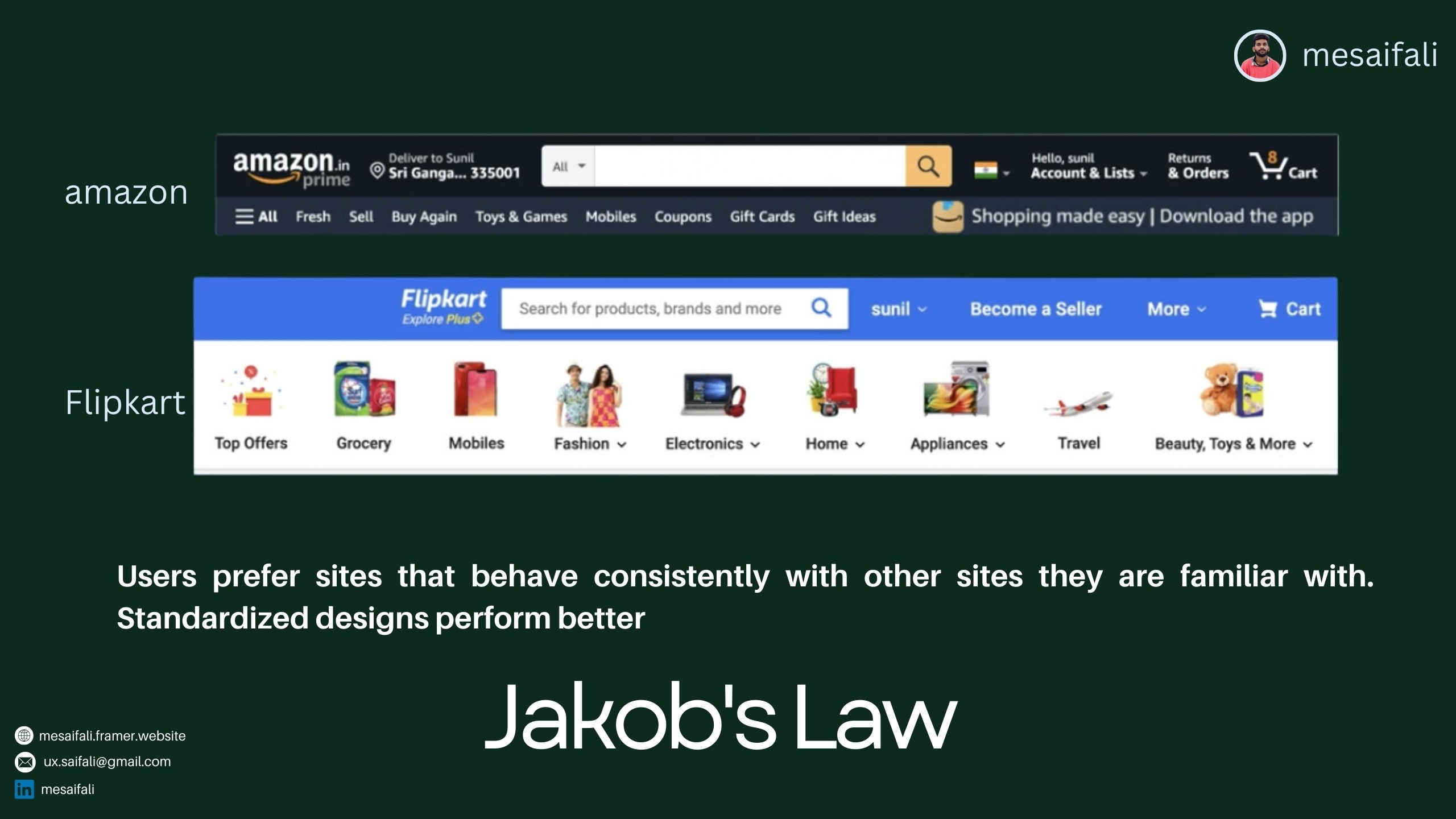
Stick to Design Standards and Conventions According to Jakob’s Law, users prefer websites that operate consistently with other sites they use daily. This means standardized elements like navigation menus, page layouts, and content organization do best. When your website aligns with established design conventions, users know instinctively where to look and how to operate different components. They can transfer existing digital skills and habits seamlessly to your site.
The takeaway? Follow conventional web design patterns rather than reinventing the wheel unnecessarily. This reduces cognitive load and friction as people navigate your site.
Law of Common Region:

Group Related Elements The Law of Common Region states that people naturally perceive page elements grouped together in a defined area to be related. Some easy ways to create common regions are adding borders around content sections or defining background colors/textures behind related components. For example, you might group all pricing information in a pricing table with borders or put your website’s primary navigation links over a common background. Such grouping establishes information hierarchies quickly in users’ minds.
Law of Aesthetic:
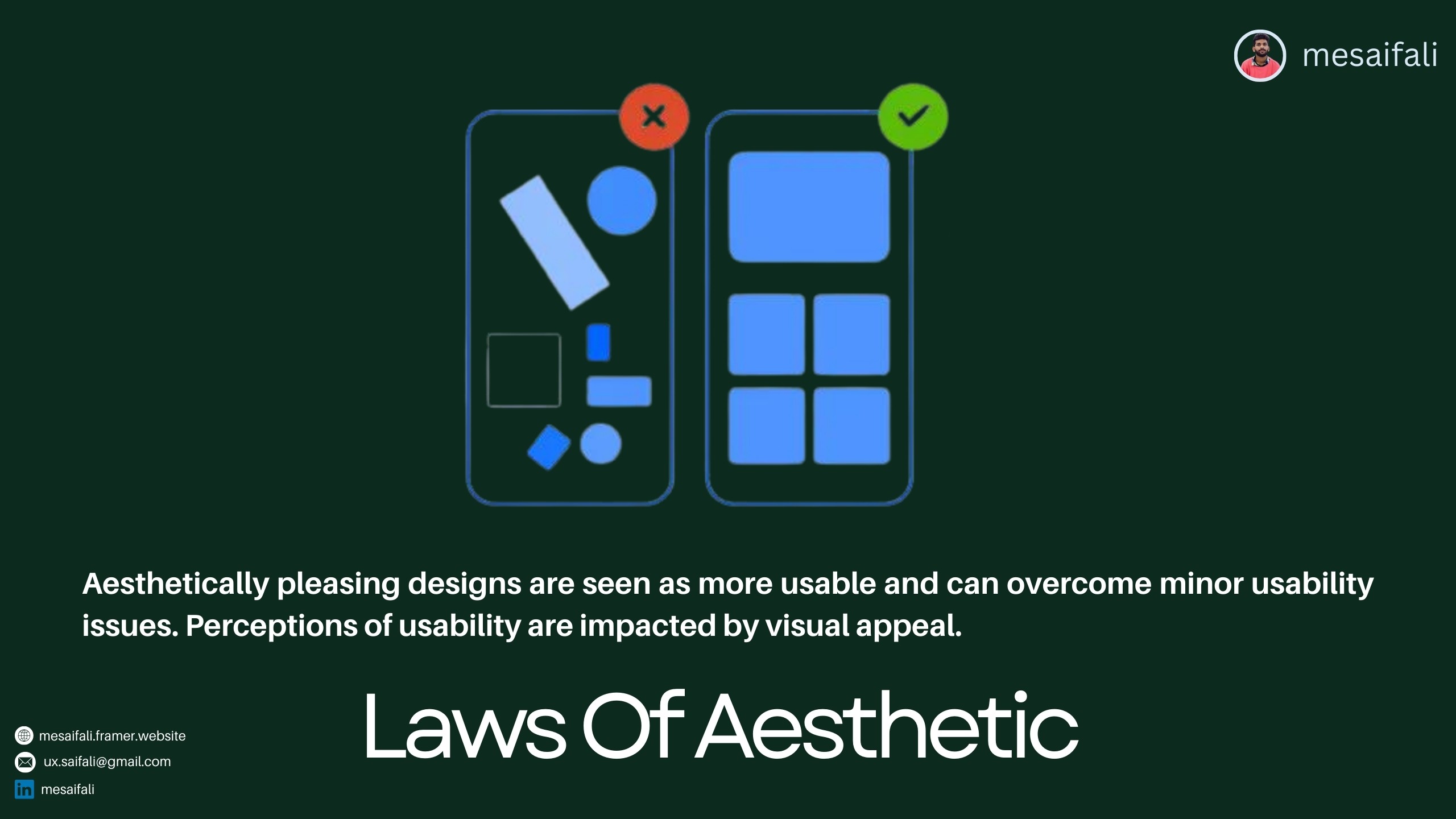
Beautiful Equals Usable While functionality is critical, visual appeal should not be underestimated. The Law of Aesthetic in web design observes that people often equate aesthetically pleasing interfaces with usable ones. We tend to tolerate minor usability issues more readily when interacting with an attractive website. On the flip side, ugly or overly barebones sites implicitly feel harder to use even when the underlying functionality remains the same. People make rapid judgments in digital environments, so don’t neglect aesthetics in pursuing excellent UX.
Fitt’s Law:
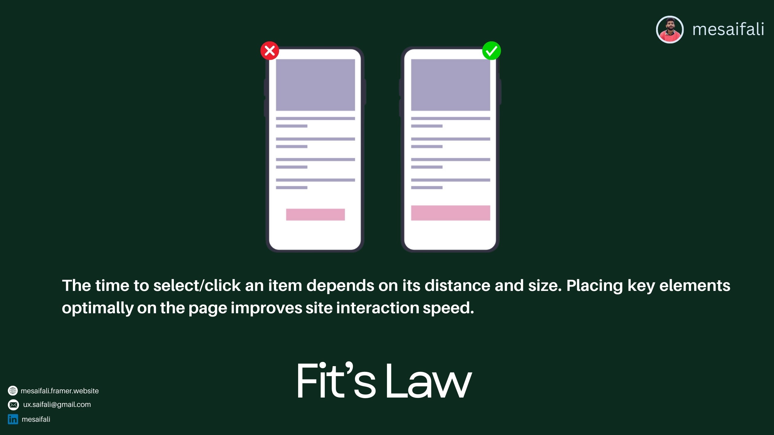
Optimize Target Sizes and Placements
Fitt’s Law is one of the most important web design principle for creating seamless site interactions. It notes that the time needed to acquire a target depends on the target’s distance from the starting point and its size. To put simply - the smaller and farther away an element is, the longer it takes someone to click or tap to select it. That’s why putting key CTA buttons and links near page focal points in properly sized containers is so essential. It optimizes selection ease and minimizes interaction friction, supporting natural user flow.
Goal Gradient Law:

Motivate with Progress Tracking The Goal Gradient Law leverages the human tendency to accelerate efforts as a desired end-point nears. On websites, you can build in visual queued to signal user progression, spurring motivation to complete key tasks. Progress bars, numbering systems, and messaging are easy ways to showcase users getting closer to checkout completion, content submission, form filling, list building, and other conversions essential to your digital business. The perceived payoff ramps up motivation as completion draws closer thanks to the Goal Gradient Law.
Law of Proximity:

Mind the Visual Hierarchy Good visual hierarchy is essential for quick information processing and recall. The Law of Proximity in web design governs this by noting that people naturally group nearby page elements as related. You can thus set clear relationships between chunks of content by website layout, establishing an intuitive information hierarchy. Mind line length, whitespace, typographic contrasts and nested visual grouping through proximity to guide users efficiently through different levels of priority across a page.
Miller's Law:

Chunk It Down Last but not least for effective web UX is Miller's Law. It dictates that the average person can only hold about 7 (plus or minus 2) items in working memory simultaneously. That means overwhelming users with long lists, numerous navigation options, massive paragraphs of text or other excessive elements hurts usability and retention. The takeaway for web design is to organize site content and functionality into bite-sized chunks. Break things down into smaller groupings of data, simpler pathways, shorter paragraphs etc so users can digest information. Segment don't overwhelm!
There you have it - 7 key laws framing web design best practices for intuitive navigation and seamless digital experiences. Each stems fundamentally from human psychology and the perceptual tendencies we all share. By championing these essential laws in your own website development efforts, you can make sure your online presence aligns perfectly with user expectations and processing capabilities. That in turn translates directly to happier site visitors, better conversions, and sustainable web business success over the long-term.
Note: Images used are from various online sources for illustrative purposes only
Having a visually appealing yet highly functional website is key to providing a great user experience (UX) online. But what makes for good web design that aligns with user expectations? Psychological principles and perceptual laws provide clear guidance. By following just 7 key web design laws, you can create intuitive digital interfaces that users instantly know how to navigate.
In this post, we’ll overview the top 7 web design laws and principles that form the basis of good UX across the internet. Master these simple rules to create sites that feel familiar, are aesthetically pleasing, and allow users to accomplish their goals with ease.
Jakob’s Law:
Stick to Design Standards and Conventions According to Jakob’s Law, users prefer websites that operate consistently with other sites they use daily. This means standardized elements like navigation menus, page layouts, and content organization do best. When your website aligns with established design conventions, users know instinctively where to look and how to operate different components. They can transfer existing digital skills and habits seamlessly to your site.
The takeaway? Follow conventional web design patterns rather than reinventing the wheel unnecessarily. This reduces cognitive load and friction as people navigate your site.
Law of Common Region:
Group Related Elements The Law of Common Region states that people naturally perceive page elements grouped together in a defined area to be related. Some easy ways to create common regions are adding borders around content sections or defining background colors/textures behind related components. For example, you might group all pricing information in a pricing table with borders or put your website’s primary navigation links over a common background. Such grouping establishes information hierarchies quickly in users’ minds.
Law of Aesthetic:
Beautiful Equals Usable While functionality is critical, visual appeal should not be underestimated. The Law of Aesthetic in web design observes that people often equate aesthetically pleasing interfaces with usable ones. We tend to tolerate minor usability issues more readily when interacting with an attractive website. On the flip side, ugly or overly barebones sites implicitly feel harder to use even when the underlying functionality remains the same. People make rapid judgments in digital environments, so don’t neglect aesthetics in pursuing excellent UX.
Fitt’s Law:
Optimize Target Sizes and Placements
Fitt’s Law is one of the most important web design principle for creating seamless site interactions. It notes that the time needed to acquire a target depends on the target’s distance from the starting point and its size. To put simply - the smaller and farther away an element is, the longer it takes someone to click or tap to select it. That’s why putting key CTA buttons and links near page focal points in properly sized containers is so essential. It optimizes selection ease and minimizes interaction friction, supporting natural user flow.
Goal Gradient Law:
Motivate with Progress Tracking The Goal Gradient Law leverages the human tendency to accelerate efforts as a desired end-point nears. On websites, you can build in visual queued to signal user progression, spurring motivation to complete key tasks. Progress bars, numbering systems, and messaging are easy ways to showcase users getting closer to checkout completion, content submission, form filling, list building, and other conversions essential to your digital business. The perceived payoff ramps up motivation as completion draws closer thanks to the Goal Gradient Law.
Law of Proximity:
Mind the Visual Hierarchy Good visual hierarchy is essential for quick information processing and recall. The Law of Proximity in web design governs this by noting that people naturally group nearby page elements as related. You can thus set clear relationships between chunks of content by website layout, establishing an intuitive information hierarchy. Mind line length, whitespace, typographic contrasts and nested visual grouping through proximity to guide users efficiently through different levels of priority across a page.
Miller's Law:
Chunk It Down Last but not least for effective web UX is Miller's Law. It dictates that the average person can only hold about 7 (plus or minus 2) items in working memory simultaneously. That means overwhelming users with long lists, numerous navigation options, massive paragraphs of text or other excessive elements hurts usability and retention. The takeaway for web design is to organize site content and functionality into bite-sized chunks. Break things down into smaller groupings of data, simpler pathways, shorter paragraphs etc so users can digest information. Segment don't overwhelm!
There you have it - 7 key laws framing web design best practices for intuitive navigation and seamless digital experiences. Each stems fundamentally from human psychology and the perceptual tendencies we all share. By championing these essential laws in your own website development efforts, you can make sure your online presence aligns perfectly with user expectations and processing capabilities. That in turn translates directly to happier site visitors, better conversions, and sustainable web business success over the long-term.
Note: Images used are from various online sources for illustrative purposes only
Other Articles


© Copyright 2024. All rights Reserved. mesaifali
© Copyright 2024. All rights Reserved. mesaifali

Available for Work
Available for Work
Available for Work
Available for Work