QFX Cinema App Redesign
QFX Cinema App Redesign
QFX Cinema App Redesign
QFX
1 Week
App Design
Overview: QFX Cinemas
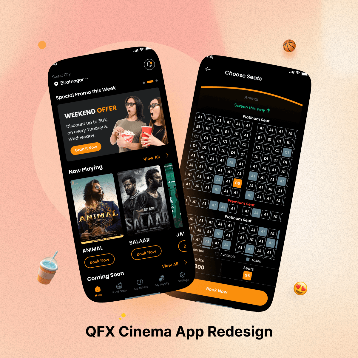
Lights, camera, design 🎨🎬! It’s time to redesign the QFX Cinemas . As one of the largest cinema service providers in Nepal, their app needed a design that would be at home on the silver screen.

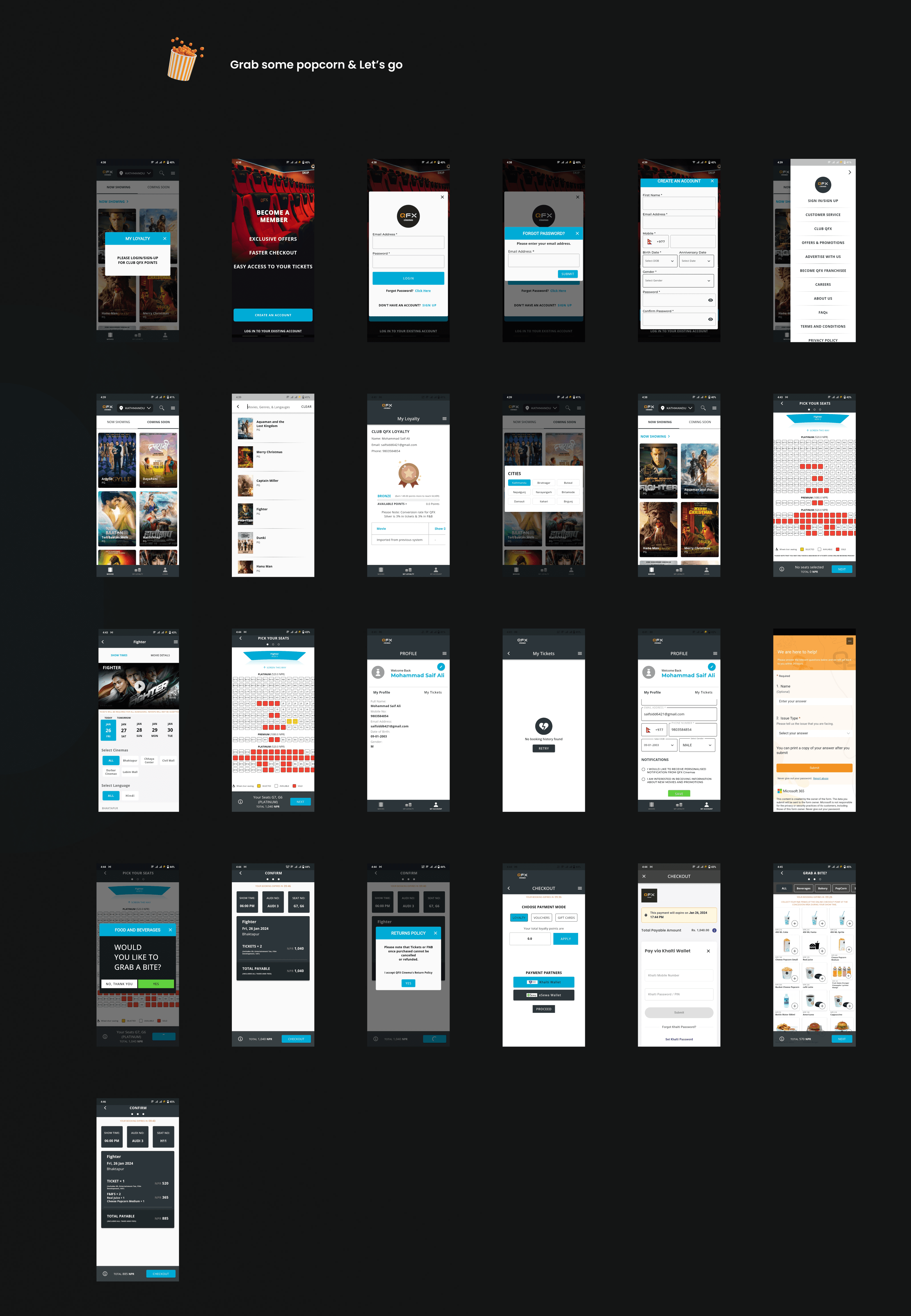
So, What actuall problem is ?
Come-on, QFX is one of the largest cimena service prvider and still their design is like Aama.(oldest movie of nepal).
Apart that , the main issue i feel as user as well as designer are:
Colors all over the place that didn’t match their brand
Outdated design patterns
Icons and typography that were inconsistent with each other
Alignment Issue
loyalty section with more twists and turns than a Christopher Nolan film.

So, before jump to Redesign UI , Let talk about what are the improvement are done in this design!
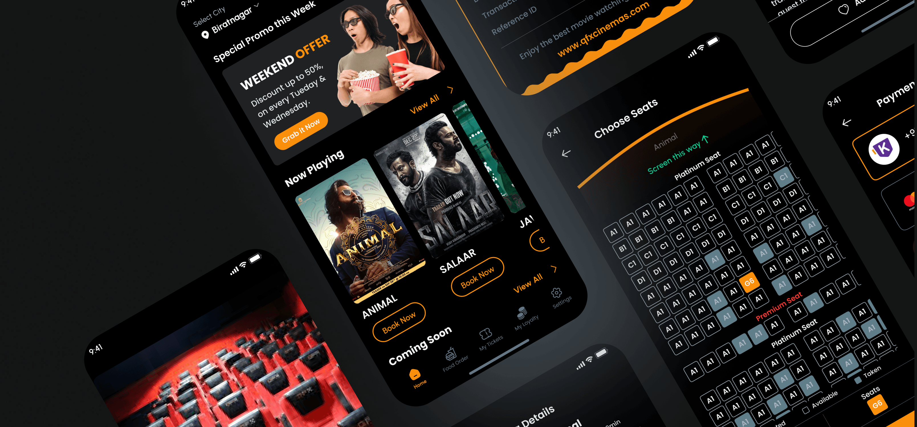
✨ Brand colors are now perfect: That yellowish-orange they used everywhere is now the main event.
✨ Modernized design patterns: Cleaned up lines and boxes; it's like watching a beautifully choreographed dance number.
✨ Unified icons and typography: Consistent across the board – even at the movies!
✨ Simplified loyalty section: Easier than finding your seat in a packed theater. And there is so much more!


Prototype and Style-Guide are available on Behance, Access Through Full View Button
Overview: QFX Cinemas
Lights, camera, design 🎨🎬! It’s time to redesign the QFX Cinemas . As one of the largest cinema service providers in Nepal, their app needed a design that would be at home on the silver screen.


So, What actuall problem is ?
Come-on, QFX is one of the largest cimena service prvider and still their design is like Aama.(oldest movie of nepal).
Apart that , the main issue i feel as user as well as designer are:
Colors all over the place that didn’t match their brand
Outdated design patterns
Icons and typography that were inconsistent with each other
Alignment Issue
loyalty section with more twists and turns than a Christopher Nolan film.


So, before jump to Redesign UI , Let talk about what are the improvement are done in this design!
✨ Brand colors are now perfect: That yellowish-orange they used everywhere is now the main event.
✨ Modernized design patterns: Cleaned up lines and boxes; it's like watching a beautifully choreographed dance number.
✨ Unified icons and typography: Consistent across the board – even at the movies!
✨ Simplified loyalty section: Easier than finding your seat in a packed theater. And there is so much more!


Prototype and Style-Guide are available on Behance, Access Through Full View Button
Overview: QFX Cinemas
Lights, camera, design 🎨🎬! It’s time to redesign the QFX Cinemas . As one of the largest cinema service providers in Nepal, their app needed a design that would be at home on the silver screen.


So, What actuall problem is ?
Come-on, QFX is one of the largest cimena service prvider and still their design is like Aama.(oldest movie of nepal).
Apart that , the main issue i feel as user as well as designer are:
Colors all over the place that didn’t match their brand
Outdated design patterns
Icons and typography that were inconsistent with each other
Alignment Issue
loyalty section with more twists and turns than a Christopher Nolan film.


So, before jump to Redesign UI , Let talk about what are the improvement are done in this design!
✨ Brand colors are now perfect: That yellowish-orange they used everywhere is now the main event.
✨ Modernized design patterns: Cleaned up lines and boxes; it's like watching a beautifully choreographed dance number.
✨ Unified icons and typography: Consistent across the board – even at the movies!
✨ Simplified loyalty section: Easier than finding your seat in a packed theater. And there is so much more!


Prototype and Style-Guide are available on Behance, Access Through Full View Button
Other Projects
© Copyright 2024. All rights Reserved. mesaifali
© Copyright 2024. All rights Reserved. mesaifali

